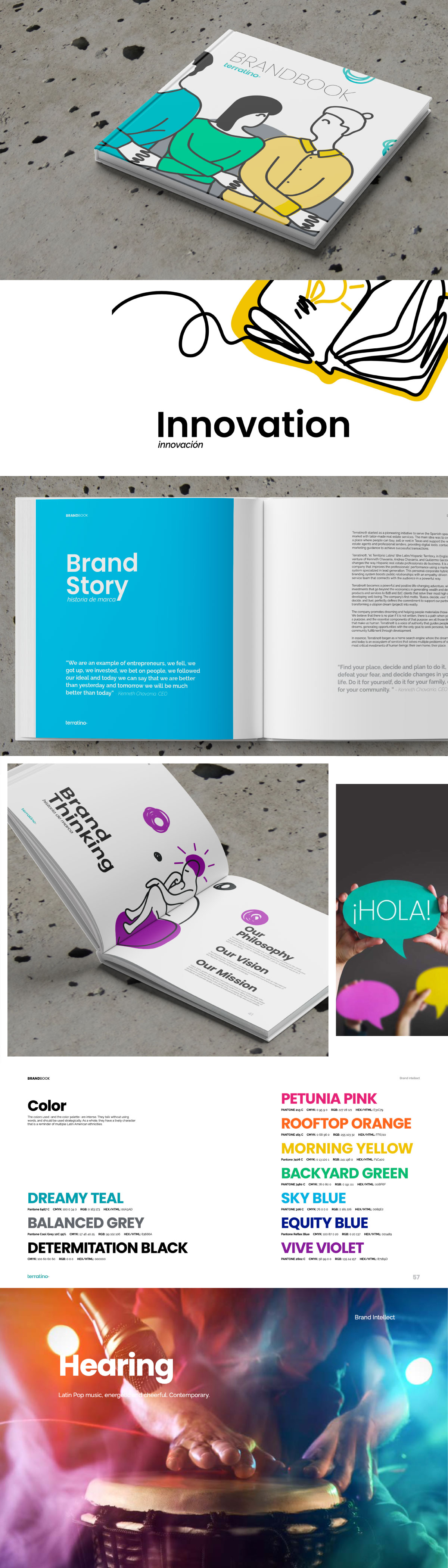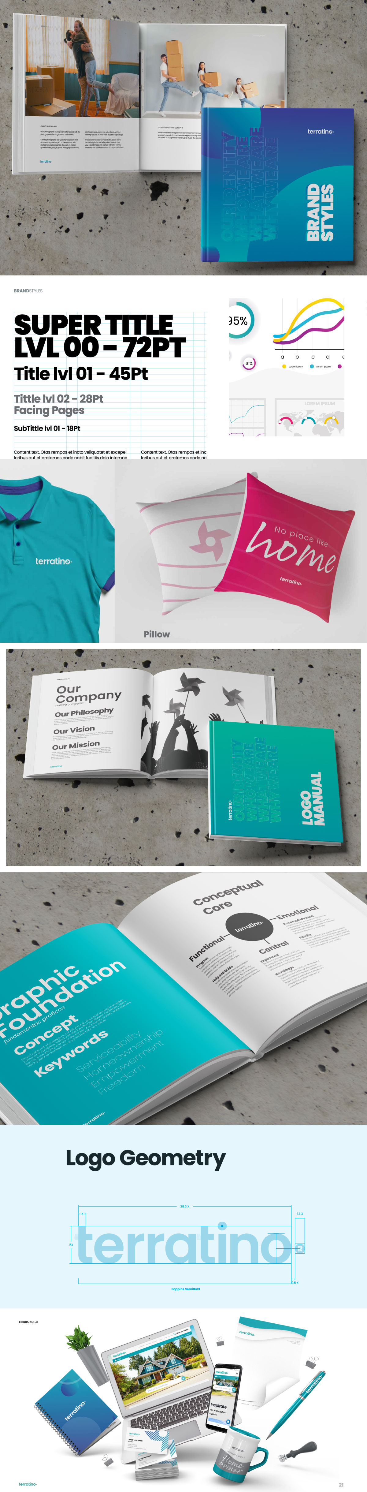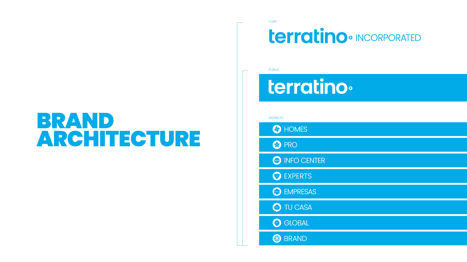
Our response was to start with a rebranding plan, establishing, in a Brandbook, new brand values that integrate each of the visions of the business units into one: Let’s progress together. In the next phase, our team designed an entire visual system that accompanies that emotional discourse and transmits it with that warmth of the Latin tradition. From subbrands, icons, and editorial grids to signage and space decoration, the style manual is fundamental in developing corporate identity. Finally, the concepts and graphic strategy that justify and control any of the logo applications/reproductions are declared in the logo manual.
Terratino is a great example of building a brand that lasts. Owners, agents, clients, and referrals remember it as a place where everyone can work to improve their quality of life and expand their business.