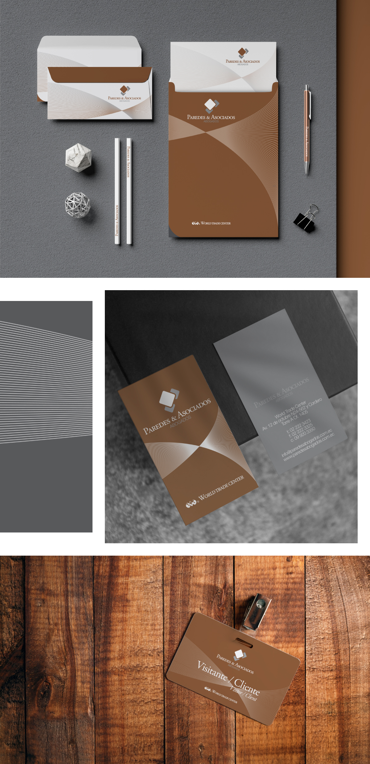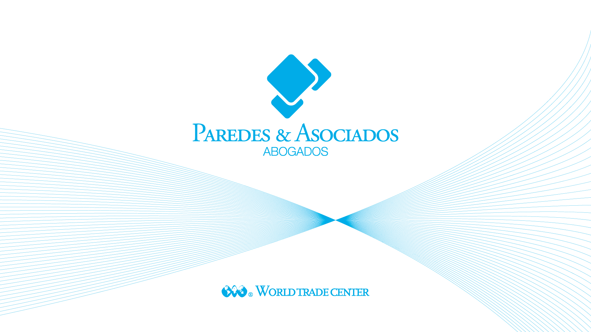
Our response was a dynamic but retro-styled logo with some graphic elements that resemble how lawyers resolve a case. The earth colors helped to bring consistency and soberness to the new brand feeling, and the geometric elements accentuated the rigorousness of law.