Alicia Treviño International
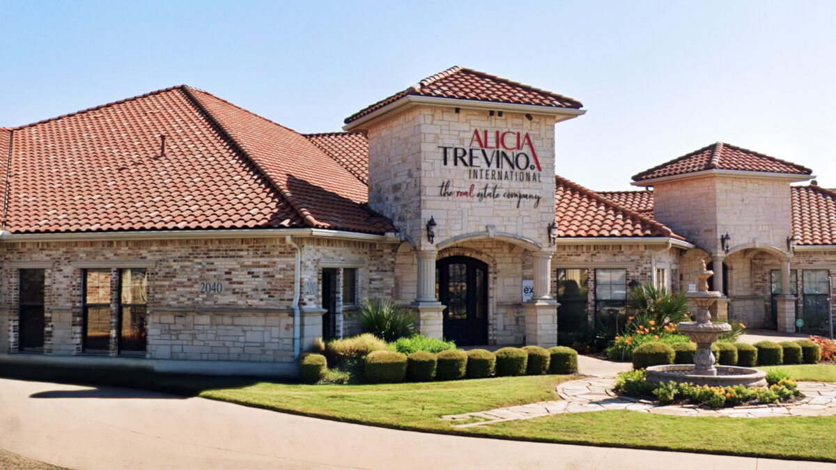
Alicia Treviño is a public person looking for her name and brand to reach a new level in the world of Real Estate. This agent-broker needed to promote a more professional and corporate image to get a global audience. The brand’s main objective was to achieve a market value that would allow it to be in the eyes of national companies and join their select club of subbrands or teams.
Furthermore, a branch of her business attends international markets, so this project not only had to anchor itself to the American narrative but also break the barriers of language and cultural perception.
Sociable loans

For “Sociable Loans”, we developed a presentation and graphic style that communicates efficiency and accessibility in the lending sector. This design reflects the company’s vision of providing simple financial solutions, using calm colors and clear graphic elements to convey confidence and professionalism, supporting its goal of being a reliable ally in the financial management of its clients.
Terratino Brand
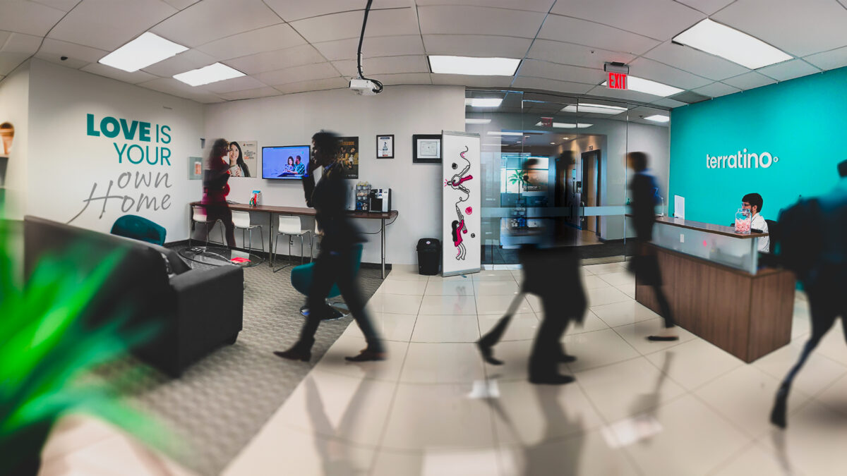
El Territorio Latino (The Latin Territory) is a company that started as a Real Estate Broker. Over time, it created a space where clients and agents could exchange information, prepare their way to buy and invest in a property, and finally build a long-term relationship that generates not only more outstanding transactions but loyalty to a brand within a market that, sometimes times it is overlooked in the United States.
The need was to integrate all the business units in one place and convert Terratino Real Estate into Terratino Multiservicios with the promise that each family could find accessible services that simplify their lives, all in the same place.
Fundity Capital
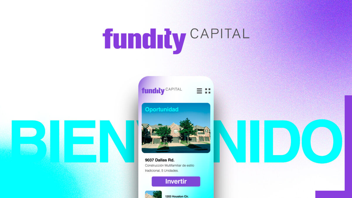
Fundity Capital needed to establish a powerful business image quickly to raise funds from private investors. The company specializes in funding loans for out-of-the-market homebuyers. One of the owners has a professional background as a trader and loves the idea of cryptocurrencies. The other owner is passionate about technology. We used these concepts as a starting point for designing and developing the project.
Paredes & Asociados

A law firm in Quito, Ecuador, celebrated its 20th anniversary of serving corporate cases and business-to-business related matters. They wished to update their image to align with the inclusion of a new generation of lawyers. In partnership with the World Trade Center brand, they aimed to look trendy and international.
La Metro Brand
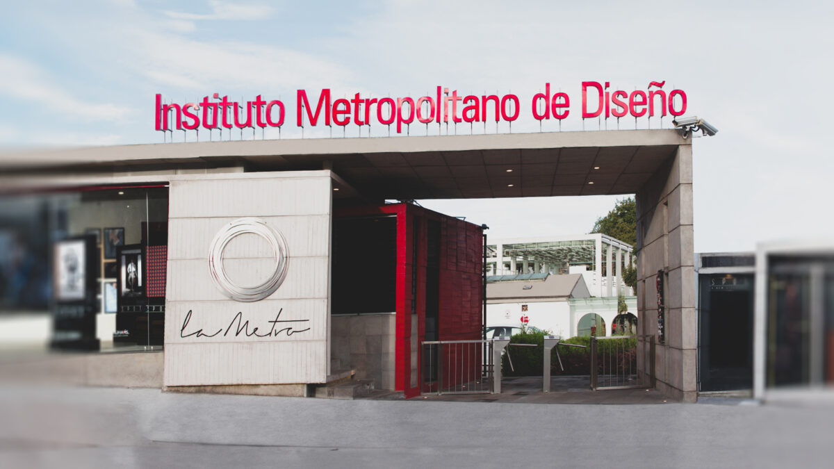
After 29 years of history, the Instituto Metropolitano de Diseño (Quito, Ecuador) needed to reflect a new vision: A world that evolves based on education and talent management. The academic center is the first -and only- design-specialized institution in the country, and that added significant complexity to the challenge: a design for designers.
JVB® Suelos y Muros

The client needed an update to their editorial line and a revision of their logo designed in the late 80s. Part of the requirement was to expand its corporate identity by adding some essential components like signage, truck wrapping, and uniforms, also updating its website.
Pazmiño-Játiva Brokers
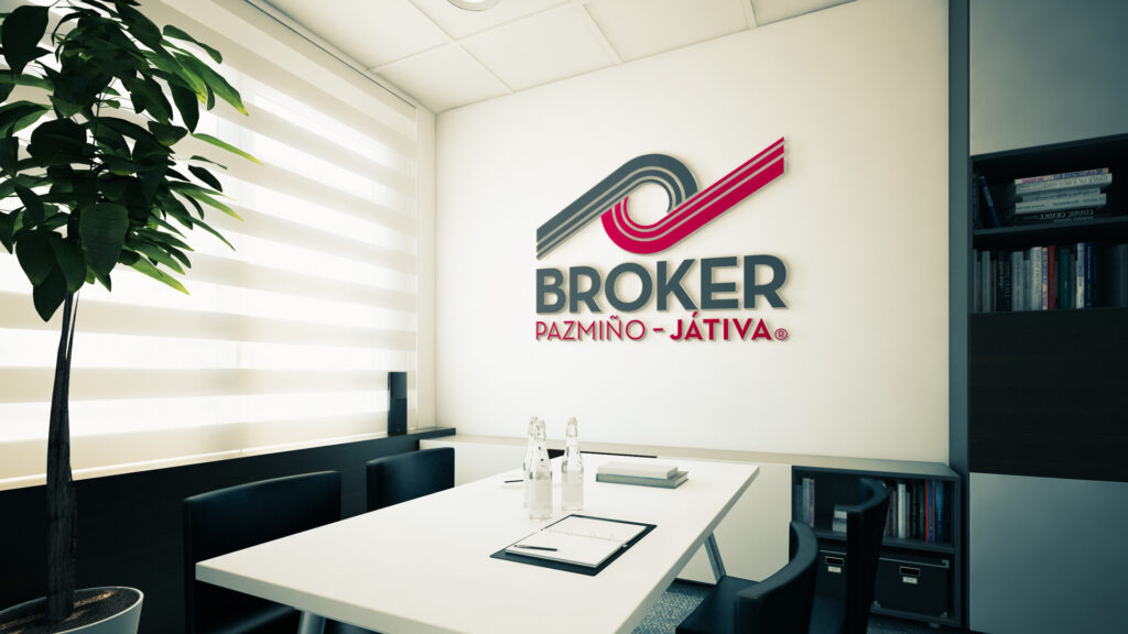
The client needed an update to their corporate image, in addition to seeking to create a regulation regarding the use of their logo and graphic elements that would allow them to expand their offices, improve their identity as a company, and engage their collaborators.
Tea Lovers

In this project, our task was to develop a series of innovative concepts for traditional tea packaging that were feasible, economically viable, and increased perceived value.
Musica Viva Philarmonic Orchestra
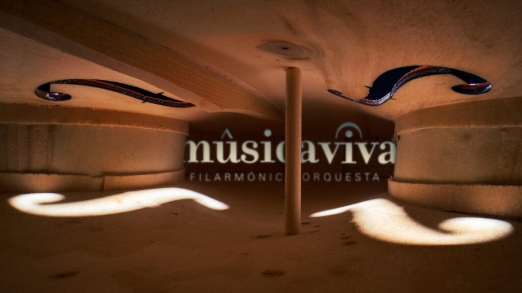
For this client, we create the corporate identity and a digital brand communication strategy that exhibits all the core values of the orchestra: talent, music, and experience.