Our Logo

Kreathink’s definitions are crucial because they establish the framework for business development. These definitions outline the brand’s foundations, contribute to its personality through daily efforts, and shape the image it presents to both its existing audience and potential clients.

Concept

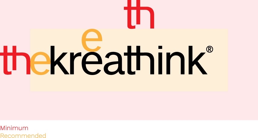
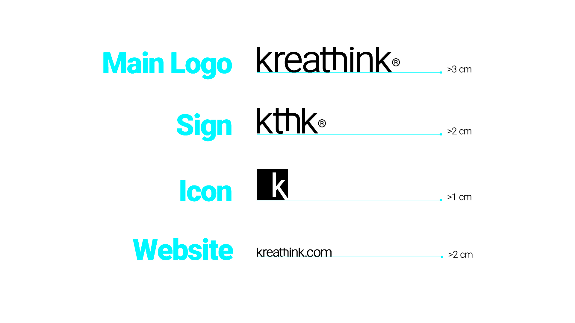
The central concept behind Kreathink®’s logo is to create a brand that is easily recognizable and understood at a glance. We love that industrial style that conveys hard work, innovation, and technological development. The name itself aims to describe everything that our organization stands for. The style is minimal, with a powerful use of black, and the typography is a classic grotesque font that communicates tradition and quality.

KEYWORDS

MODERN
FEARLESS
ENTREPRENEUR

GRAPHIC STRATEGY

Substance

Our work is modern and fearless, reflecting the spirit of entrepreneurs and innovators. We push creative boundaries to deliver impactful, future-focused branding solutions that empower businesses to succeed.

Management

We approach our work pragmatically, guided by research and a deep understanding of market trends. Our conscious decision-making ensures that brand strategies align with client needs, balancing creativity with real-world business objectives.

Workflow

Our workflow involves experimentation and learning from each project to refine our methods and strategies, enabling us to adapt quickly, stay innovative, and focus clearly on delivering high-impact designs.

Structure

We ensure a consistent visual identity by aligning all images, styles, and plans with the latest technology. This results in a strong brand presence across all platforms, supported by a solid design and organizational foundation.

COLOR PSYCHOLOGY

This palette, as a whole, signals a brand that balances emotion and logic. While black and gray communicate stability and control, cyan and white emphasize creativity, innovation, and transparency.

This palette creates an overall feeling that Kreathink®, a forward-thinking company, is both powerful and creative, offering structured solutions that are clear, simple, and easy to implement.

K black

Power
Sophistication
Authority

RGB: 0 0 0
HTML: #000000
CYMK: 100 100 100 100

K GREY

Neutrality
Balance
Dependability

RGB: 109 110 113
HTML: #6d6e71
CYMK: 58 49 46 15

WINTER CYAN

Innovation
Clarity
Optimism

RGB: 60 212 247 
HTML: #3cd4f7
CYMK: 60 0 5 0

Typography

Oswald is a professional, condensed sans-serif typeface specifically reworked to excel on digital screens. It is a modern take on the classic “Alternate Gothic” style, featuring a tall x-height and narrow letterforms that make it exceptionally space-efficient for web layouts.

KREATHINK®

KREATHINK®

KREATHINK®

KREATHINK®

KREATHINK®

KREATHINK®

Abc

Oswald is a variable font. Designed by Google® Inc.

LOGO USAGE

Clear Space

Clearspace is defined as the area around the logo that is free of other elements (including page or other surface edges). A clearspace of a “e” prohibited and “th” restricted from the logo is recommended.

Logo Composition

These are pivotal for ensuring the adaptability and effectiveness of a brand across diverse platforms. These variations enable seamless integration on digital screens, print materials, merchandise, and promotional items, ensuring clarity and impact at various sizes and orientations.

Minimum Size

This logo size scale is the specific guideline for reproducing our symbol over any surface depending on available white space. These compositions should be selected based on two criteria: Readability, given by the media, and the reproduction or printing process chosen.

official Logo

Our logo is a combination of text, images, symbols, and colors that distinguishes our brand or company from the competition. It serves as a visual representation that creates a connection with the audience or customers.

Primary Color

Secondary Color

Seasonal Color

Greyscale

White

Black

official ICON

Think of our icon as a brand’s stylistic extension. Once the big picture of a brand’s messaging has been established, icons serve as visual tools that help carry out this message. Also, icons are useful elements that can be consistently used across diverse platforms.

Primary Color

Secondary Color

Seasonal Color

Greyscale

White

Black

color guide

Every application of our logo should strengthen and reinforce the organization’s positive image. The logo is a fixed design element that may not be edited, but the color composition may change depending on background images, colors, or materials.

White

Primary

Secondary

Seasonal

DO´S & DONT´s

To ensure that our logo is always recognizable, it must be used consistently, with discipline, and with precision. The power of a logo is easily weakened by its incorrect use.

Compress

Expand

Blur

Borders

Skew

Flip

Arbitrary Rotation

Crazy Colors

Incomplete

Art Filters

Shadows

Outlines